
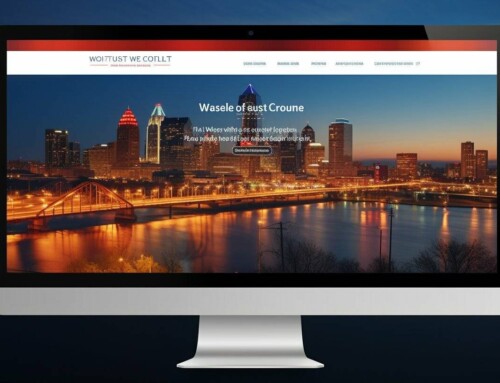
Since the year 2010, having responsive web design has become more of a requirement for any business that is looking to build or maintain a substantial market share online. The methods by which the average person accesses the Internet are constantly changing, and companies must keep up with the representation of their brand online.
What exactly is responsive design?
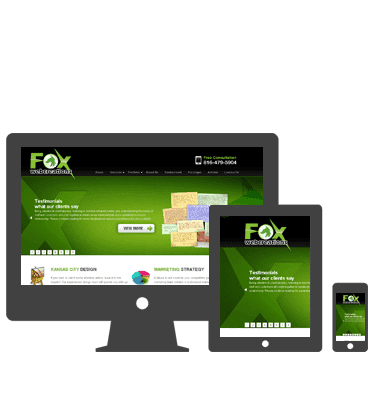 Before you can begin building your responsive website, you need to understand exactly what is meant by the term. Having a responsive website means that your online brand can be seen effectively by your customer no matter what device that customer accesses your website from. Whether your site is being looked at on a large tablet or the skinniest of smartphones, the user experience will be a good one for your customer.
Although there are many things that have changed in responsive design since the term was coined five years ago, there are some things that have definitely stayed the same. Here are some responsive design best practices that you will be able to implement well into the foreseeable future with no disadvantage.
First, you must definitely support multiple display types with flexibility.
The different resolutions of different operating systems and mobile devices require that your responsive web design caters to various needs. You can most effectively implement this by leaving out load-time heavy multimedia that relies on the latest resolution in order to display properly.
Second, you must support multiple input mechanisms.
The new technology that everyone is implementing for web content is the touchscreen. If for example, your website is dependent on mouse hovering to work, you need to update your user experience.
Third, you must use Media Queries and Breakpoints.
Utilizing Media Queries will help you to deploy your adjustments when they are needed because you will never know exactly when they will be needed.
Fourth, make sure that the media that is on your website can display itself flexibly.
As mentioned above, be sure that any media that you use inside of your website can be sized in a fluid manner. You do not want to have pictures that are too big or too small for the different display sizes that current operating systems employ.
Fifth, use the viewport meta-tag.
In the rush to create a coding standard for responsive websites, the viewport meta-tag and its CSS equivalent can definitely help your website to behave in a manner that will improve the user experience.
Web Design Kansas City
Having a responsive design will increase the return on investment of your website overall. Fox Web Creations is the <a title=”Kansas City Web Design
Fox Web Creations” href=”https://www.foxwebcreations.com/” target=”_blank” rel=”noopener”>Kansas City web design company that can help you to create a responsive website if you do not have the time to do so on your own.
When you are in a highly competitive environment such as Kansas City, then your business needs every advantage that it can get. A responsive website will make sure that you maximize your communication with your customers. You will also be able to take advantage of any weaknesses that your competition has with its communications.
Getting a responsive design is one of the most important upgrades that you can invest in for a business. You may think that taking the time to code a few extra lines or hire someone to do it is overwhelming or too much of an investment, but the truth is that the entire process will be over before you know it. After that, you will be able to fully engage with any customer from anywhere! For more information on how responsive web design can help your business connect with customers, call Fox Web Creations today.