
Our Skills
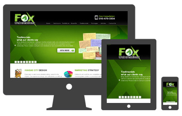
As of February 2012 over 49% of the U.S. Mobile market are using smartphones capable of Internet browsing. As the mobile web design in Kansas city industry grows at incredible rates, it is important to consider RWD with your web site to keep an edge in your market. RWD is a key component to keep your website easily viewable as the number and specifications of smartphones and tablets increase in the Mobile market.
There are many professional websites online now that utilize Responsive Web Design. The technology has been gaining in popularity in recent years for it’s ease of use on smaller devices. RWD is probably best understood if you visit the same RWD site on all of your different devices. This will show you how RWD technology is an innovative way to keep web visitors engaged regardless of the screen size or resolution. You can test this yourself with any of the following websites:
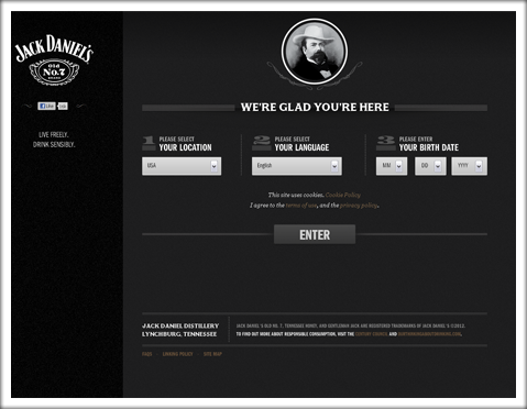
Jack Daniel’s
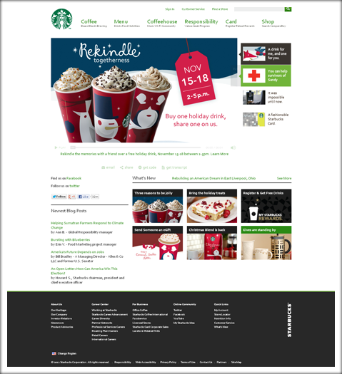
Starbucks
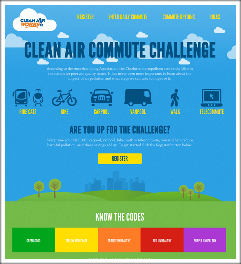
Clear Air Challenge
We get a lot of calls from potential clients who feel like they need a mobile application for their current website. At Fox Web Creations we believe that it is extremely important to have a mobile web strategy. The issue is that Mobile Applications can only be utilized on certain platforms and operating systems (for example Android vs. iOS). That means that the programmer would need to create a different code for each operating system which increases the time line for the project as well as overall costs. Responsive Web Design, on the other hand, uses programming that will be viewable on all devices regardless of operating system and screen size, saving time and money.
If there is a down side to RWD, it is only that it takes more time than traditional web design and is therefore more expensive. Layout planning requires more thought—elements like the amount of text and the simplicity of navigation must be considered—and the final product must honor the ergonomic limits of what our eyes are comfortable seeing. Testing efforts are also heightened, with constant check-ins to ensure that responsive sites function as intended. For clients, this means higher costs and longer lead times up front.
Responsive Web Design is a good investment for the future of your website. To ensure that your website will look good on current devices in the market as well as devices that don’t yet exist, RWD is highly recommended as a safeguard for the integrity of your website. At Fox Web Creations, we strive to provide our clients with the most innovative technologies available. Please leave us a comment below or contact us for a free quote. We’d love to help you with your next Responsive Web Design project.
Our Clients