
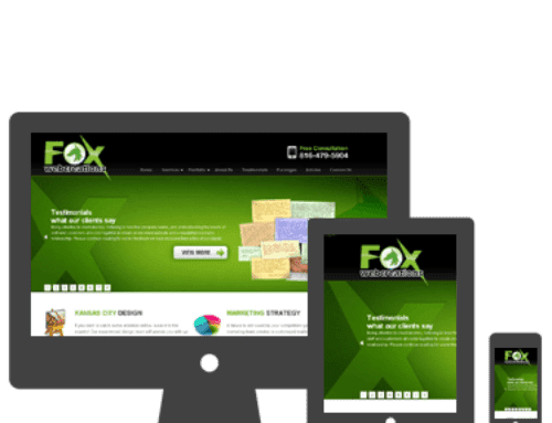
 Responsive web design is a website layout that uses specific lines of code to adjust the way a website displays across a variety of devices. Choosing this format for your business website offers many benefits that allow you to reach more customers and enjoy a greater return on your investment than with other methods of web design.
Built to Specifications
Well-versed web designers can take your vision for a responsive website and turn it into a customized theme that looks and acts exactly the way you want it to. This means being able to increase brand visibility and create a seamless experience for all users across all platforms. As a business owner, you know the importance of consistency. With web design in Kansas City, you can deliver exactly that to every customer who accesses your site.
Streamlined Features
Whether you start with an existing responsive framework or have your site built from the ground up, it’s possible to streamline the code, layout elements and widgets to include only what you need for your site to be fully functional. Less code means faster loading time, and the quicker your site loads, the more people are likely to stay to browse products and make purchases.
Improved User Experience
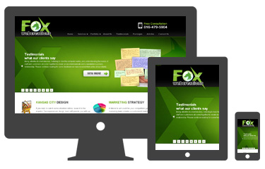 Responsive design takes the guesswork out of determining which devices visitors are using most often to access your site. The flexible layout automatically adapts to computers, tablets and Smartphones of all sizes. This increased accessibility opens up your business to a wide audience of potential customers by allowing more people to comfortably access your site from a variety of locations and has the potential to significantly increase your sales.
Better SEO
With a responsive layout, you only have to worry about implementing an SEO strategy for one website. You have one set of pages with one set of URLs for search engines to crawl and little or no risk of duplicate content. This increases visibility while decreasing the amount of work you have to do to ensure good placement for your site. Mobile-friendly sites tend to rank higher in local search as well.
Consolidated Analytics
Directing all users to the same site makes it much easier to track how your SEO tactics and advertising campaigns are working. Instead of having to look at analytics information for your main site and a mobile site, all of your visitor information is in one place. There are no redirects to deal with and you’ll be able to get a clearer idea of the devices that customers are using most often and which pages they’re accessing. This can help improve your web strategy overall.
The Kansas City web design team at Fox Web Creations can work with your business to develop a customized theme for your responsive site that works seamlessly and looks great. Our custom web design services can boost your business by creating a site that’s optimized for any device that your visitors might be using, thereby providing instant connections between you and your customer base.