
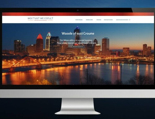
 A number of companies offering website development Kansas City are now focusing on responsive design, delivering a multi-device friendly approach. This technique is recommended by Google and followed by some of the most famous websites around the world. If you’re thinking of designing and developing a responsive website, read on to know the best practices to ensure seamless viewing across all devices:
1. Plan for Small & Big Screens
Responsive design drives a better experience for mobile users and this has largely contributed to its success. However, many times, designers make the mistake of only thinking about mobile and forget about the larger display sizes. Though mobile users contribute to the majority of website traffic, desktop screens shouldn’t be ignored while designing websites. Many users also tend to jump between devices during their day and thus, designers must pay equal importance to large screens.
2. Analyze The Image Quality and Download Speed
It is important to find the right balance between quality images and your page performance. Especially if your website is largely image-based, you might need to consider every page’s visuals and be aggressive in removing the unwanted images. If you use a static image instead of a carousel of 4 images on the home page, you can reduce the size of the page by nearly 75 percent.
3. Choose Your Font Sizes Carefully
Remember that font sizes play a significant role in responsive design. The sizes must change according to the layout for easy readability. Normally, a 16pt body type is ideal to start for most screen sizes. Your heading should be at least 1.6 times of the text to attract attention. Also, keep an adequate contrast between the background color and the color of the text and other links.
4. Pay Attention to Input Methods
Different devices have different input methods. For instance, desktop users will use a mouse and keyboard to input information while mobile users will do everything on a touch screen. Be generous with the clickable areas and the size of buttons you design.
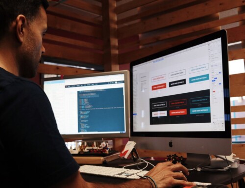
5. Test on Real Devices
While it’s great to plan out how your website will work on various devices, a theoretical approach isn’t enough. You must interact with your design on all possible devices to see what works and what needs improvement. Along with testing it yourself, you should also test your responsive website development Kansas City with actual users in a real world setting.
A successful responsive web design is one that understands the intricacies of every device and elevates the layouts for best usability across all platforms.