

For a long time, we have been encouraged to think outside the box, break new grounds, and be creative. Doing so ensures that we break from the norm and create new things. However, following this rule in some cases might be counterproductive.
When designing your website, you would be concerned with delivering a unique appearance that sets you apart from the millions of websites present on the web space. Nonetheless, there are general best practices that you must follow.
Failure to pay attention to these details would make your website a mess which would invariably affect user experience. Thus, this post outlines the practices a Kansas City web designer would help you enforce.
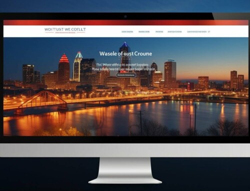
Specific Item Placement
Due to common practice, people expect to see certain things when they browse a website. Research has found that close to 100% of top websites have their logos placed on the upper left corner of the website. These websites also have a clickable logo.
Also, the company or individual contact is usually placed at the top right corner of the site. This rule is not as strictly followed as the logo rule but should be taken into account nonetheless.
Finally, navigation should be placed at the top of the website and should also be in the vertical form. These rules are important because they have been permanently enforced in the subconscious of visitors.
Limited menu Options
While you want to give your user/visitor an abundance of options on your homepage, you would achieve more by doing less. Abundant menu option succeeds only in confusing the user and making it difficult to make any concrete choice.
Best practices dictate that you streamline your menu options to only the most important and leave out things that could qualify as a sub-heading. According to Econsultancy, 3 or 4 menu options are enough and anything more would be risky for your site navigation.
Keep Your Site Light
Nobody has the time or patience to wait for your website to load completely. The average internet user wants to see your homepage within seconds. Thus, pilling your site with heavy graphics or video content would not serve your interest.
If your website needs to have heavy graphics or video content, it would be best to have a large bandwidth, web optimized graphics and video content and a strong network infrastructural to back it up. However, if you cannot afford the time and cost then it would be best to keep your web pages as light as possible in order to have a short loading time.
Make Your Site Responsive
A report released by Statcounter in 2016 holds that over 51% of internet users access the internet over their phones or tablet devices. This figure can have serious consequences for your website as they determine the amount of traffic you get.
To capture this percentile, you need to make your website design responsive to various platforms. The old practice of designing two separate websites for mobile and web is no longer effective and would result in the least flexible web pages.
A Kansas City web designer would ensure that these rules are adhered to while designing your website.