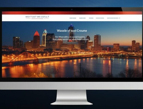
Website design evolves annually in terms of usability. User experience is typically the metric that all web development companies use to craft cutting-edge designs that please visitors to drive conversions. In fact, most organic conversions occur as a result of a well-optimized and aesthetically pleasing site.
It’s important to note how trends shift annually in website design, and being up to date in terms of how you formulate your user interface will make growth possible. Leaving design to contain age-old elements that you never touched in the past decade can damage your legitimacy as a business, so it is crucial always to optimize. Whenever possible, take a look at these projected design trends for the coming year to stay on top of the business webpage game:
-
Build a Dark Mode
Lots of light tones and bright colors can be painful to the eyes. Computer and phone screens are very bright nowadays and can display high contrast colors and tones, making them powerful devices. However, not everyone likes seeing strongly projected lights because these can ruin their eyesight or cause eye strain. Here, the trick is to develop a dark mode that shifts the color palette into smoother, darker tones. This mode is helpful during darker hours of the day where people are more active, leading to increased conversions.
-
Combine Colors for a Bold Effect
Some colors might not look good together, but even if you don’t follow the usual complementary color wheel and go against the grain, it can work in your favor. As long as your web development elements are in line and easy to navigate, colors can propose increased aesthetic value. People are more inclined to trust brands that play with various colors, as plenty of the dominant industry leaders have established themselves using neutral palettes. By playing with multiple colors that tie into your products or services, you can have a whole system that works incredibly well for the viewer’s eyes.
-
White Space
White space is always better than cramming multiple things into one page. This concept entails putting plenty of neutral zones that have zero page elements for an easy-on-the-eyes design. It has two benefits: it allows pages to load faster because of the reduced graphical load, and the second is that it looks excellent and minimalist. Never skimp on white space, as you can put more pages to branch out instead of having a jam-packed home page that looks horrible in website design.
-
Utilize Asymmetric Website Design
Creating a page that doesn’t follow traditional design theories can also be beneficial. Many businesses tend to rely on a grid-based layout that allows for even distribution of page elements. What symmetry does is that it disables the ability to be genuinely creative in terms of design. When following a pattern or a grid, there is limited ability to go all out and be unique. 2021 is meant to break out of our shells and destroy old trends, so asymmetrical aesthetics are undoubtedly the new normal.
-
3D Graphics (Sparingly!)
Enticing viewers is a must, and there’s no better way to do this than have some tastefully made 3D graphics. These website design elements are the best way to catch attention, so deploying these during a sale can be done. However, note that these might be heavy on people’s devices, which will cause slower (and more irritating) load times. Use them sparingly but professionally!
Conclusion
Web development is a service that has considerable power at driving conversions, as a well-created site will trump all others. People rely on their senses and their perception of what is nice to look at, so toying with visitors’ user experience will help craft brand recognition and recall in visitors.
Fox Web Creation is a web development agency in Kansas that offers full-service online marketing, SEO, and graphic design worldwide. Stay up to date with the latest trends in the digital sphere and invest in our services for improved conversions today!