
When it comes to web design, many focus on the color scheme, layout, and images as the top heavy-hitters that can influence the user’s experience. While it’s true, there are also features that can do more for your goals than meets the eye.
Part of the overlooked elements in a website includes the call-to-action button. It’s easy to ignore compared to other changes you can make for your web design, but the CTA buttons play a pivotal role in encouraging your target audience to take your desired action.
If you’re wondering how a simple button can become a powerful tool to boost your conversion rate, here’s how you can transform it into a compelling feature on your website.
Tip #1: Make Your CTA Buttons Look like Click-Worthy Buttons
Many marketers assume that to grab people’s attention, they need to go for head-turning gimmicks. Attaching buttons to catchy hyperlinks, flashy GIFs, and other complex features seems like a creative way to make your CTA clickable, but it will only make the buyer’s journey complicated.
A compelling CTA button doesn’t need visual clutter nor intelligent design, it only needs to be a button that prompts the user to perform the next action. If the user struggles to find the next step – which is to sign up for your newsletter, check out their virtual carts, and more, then it means the buttons favor design over functionality.
Keep it simple by making sure everyone knows they are buttons!
Tip #2: Use the Right Color Scheme
When it comes to CTA buttons, it’s true that less is more, but simplicity doesn’t equate to a lack of sophistication. Adding visual appeal can do wonders for making your CTA buttons stand out, especially in a sea of text.
Even with a minimalistic design for your buttons, choosing bold or contrasting colors can make it easier to catch their attention and evoke the right emotion from your customers. For example, using orange for your CTA buttons pop out of the page, especially when paired with a blue backdrop.
Tip #3: Include Relevant Copy and Add a Sense of Urgency
Now that you have the color and design in place, the next step to make your CTA buttons even more clickable is to include a compelling yet concise copy. The right text should deliver your message clearly and make the next step simple to take for your users, so be sure that it answers questions to streamline the buyer’s journey.
The Bottom Line: The Impact of a Visually Compelling CTA Button on Your Website’s Conversion Rate
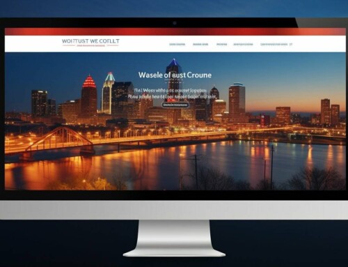
The online landscape has steadily dominated various sectors of the economy, and now that 2020 is over, the new year is facing a bigger demand for digital solutions more than ever. Websites can no longer become a second-thought in your marketing funnel, that’s why many strive to improve their web performance to start 2021 on a positive note.
Why Choose Us?
Strengthening your brand’s competitive position in the online marketplace can be tricky, but our multiple-faceted web designers in Kansas City can boost your digital presence in more ways than one.
We offer client-centric services such as search engine optimization (SEO), e-commerce development, web development, logo design, and more. Get in touch with us today at (816) 479-5904 to get a free quote and see what we can do to help you achieve your web performance goals.